Let’s explore the function area of the UX page a bit.
The Function page comes up when visiting covecube.com, and clicking on “Function” after the intro.
No intro version: covecube.com/quick
The Function area:
Shortcut:Â covecube.com/function
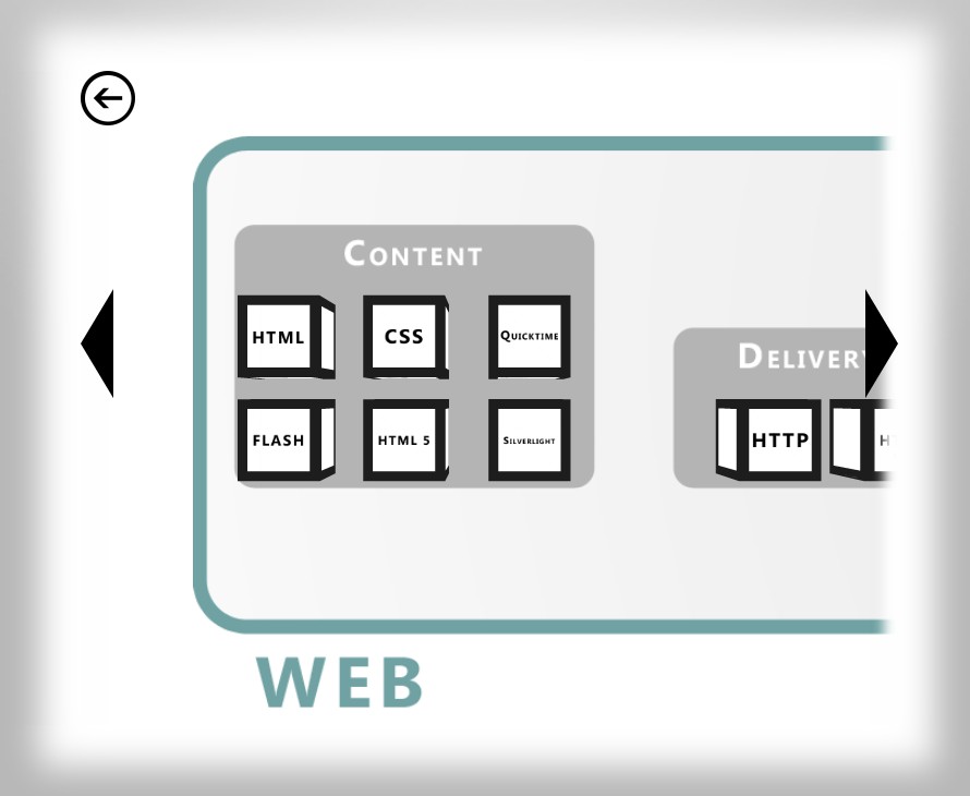
The Function area is meant to represent technology in general. As soon as the page loads you will see cubes, each cube represents an important technology. The cubes are organized by type of technology on a technological map.

The map is not comprehensive, but is meant to represent some important technologies. Clicking on a cube brings up information about that technology.

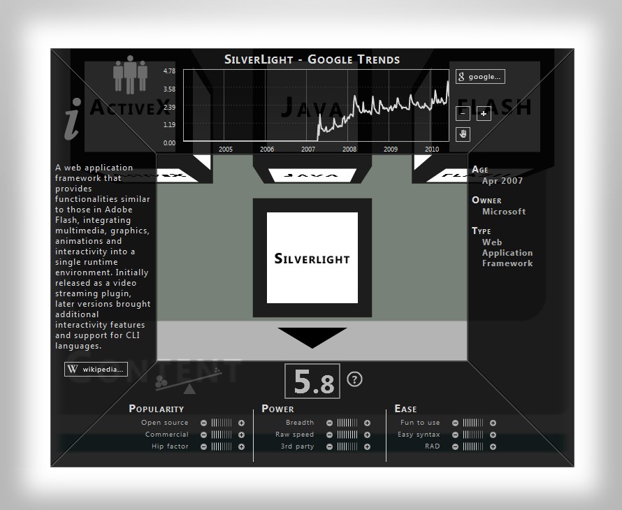
On the left we have an excerpt for wikipedia.org and on the right important facts about it. The age in some of these may be a bit subjective. Sometimes a technology evolved from a few other technologies over some period of time. In cases like these, the rule of thumb was to pick a date when the technology came into its own.
The top chart is a dynamically updated graph from Google Trends. You can pan and zoom it using the controls to the right. Looks like Silverlight is on its way up.
The bottom panel is a little different. It is a combined technological score based on user votes, right here at Covecube. Every technology has 3 major attributes and each of those has 3 minor attributes.
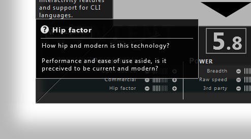
If you want to see what each attribute means, just hover over it with your mouse.

How Voting Works:
- For every technology, you can vote once per day, per attribute. So you can vote on Silverlight’s Hip Factor only once today.
- The attribute rating is a 1 to 10 average of all the votes for the past 90 days.
- The overall score is a 1 to 10 average of all the attributes.
